Making It New
[Images follow essay]
When I was in high school, I would go to the Menil Collection every day after school to smoke weed and lay in the sun. I remember going there all the time with my friends Josh and Camille and David. We would climb a big beautiful tree (which was cut down last year) and also on the Mark di Suvero sculpture Bygones. Sometimes—if we were feeling reflective—we would sit by Barnett Newman’s Broken Obelisk or quietly think in the Rothko Chapel. Every now and again we would walk over to the main lawn and lie in the grass parallel to Michael Heizer’s Isolated Mass / Circumflex #2 or sometimes sit cross-legged in its counter form. But we only did that on special occasions. With the exception of the Rothko Chapel, I never really thought about these sculptures as artworks, but instead considered the collection as the landscape of my childhood. Founded by Dominique de Menil, the French heiress to the Schlumberger fortune, the Menil Collection believes in accessibility and is always free. The museum’s holdings are diverse, including early to mid-twentieth century works and an extensive collection of pop art and contemporary art. The permanent collection also includes ancient, Byzantine, medieval, and tribal art. Philippa de Menil, the daughter of Dominique, was one of the founders of the Dia Foundation.
I first discovered Dia:Beacon a few years after I moved from Houston to New York City. My parents had bought a house in upstate New York, about an hour from the museum, and the Dia:Beacon became a semi-regular detour before heading back to the city on Metro North. Dia:Beacon focuses on art from the 1960s and after and primarily features works by minimalists, land artists, and conceptual artists. The museum creates amply scaled space for work that often attempts to transcend the traditional gallery context. While Dia:Beacon is an institution, its space is designed around artworks, instead of the other way around. Even though I had been exposed to these works throughout my life, at the Dia:Beacon and the Menil Collection, it was not until I went to graduate school that I would learn about the land artists, many of whom—like Walter de Maria, Michael Heizer, and Robert Smithson— are prominently featured at these museums.
Land artists were trying to transcend the limits of painting and sculpture and the restrictions of making art for the gallery space. They often did this by making monumental earthworks in the American Southwest. The documentary Troublemakers: The Story of Land Art discusses works such as Robert Smithson’s Spiral Jetty and Walter de Maria’s Lightning Fields, both of which are part of the Dia Foundation collection. The film talks about the land artists’ interests in unlearning and quotes Nancy Holt saying, “It was a matter of unlearning a lot of really sophisticated things that we had learned in our early adulthood.” The artist Walter de Maria talks about his transition from painting to land art, saying, “My new brush is a Caterpillar.”
![]()
When I was in the third grade, my parents placed me and six small cardboard boxes in the bucket of my father’s JCB front-end loader. My father extended the loader’s arm and lifted me eighteen feet in the air. I carefully pushed each box over the edge, too afraid to look down or to even peek my head over the bucket’s siding. Each box contained a single stemmed wine glass and a different packing material: foam, peanuts, bubble wrap, crumpled brown paper, and tissue paper; one box did not have any packing material. I was testing to see which material would offer the best protection for the wine glass and keep it from breaking. Most of the glasses broke, but my project received first place at my elementary school science fair.
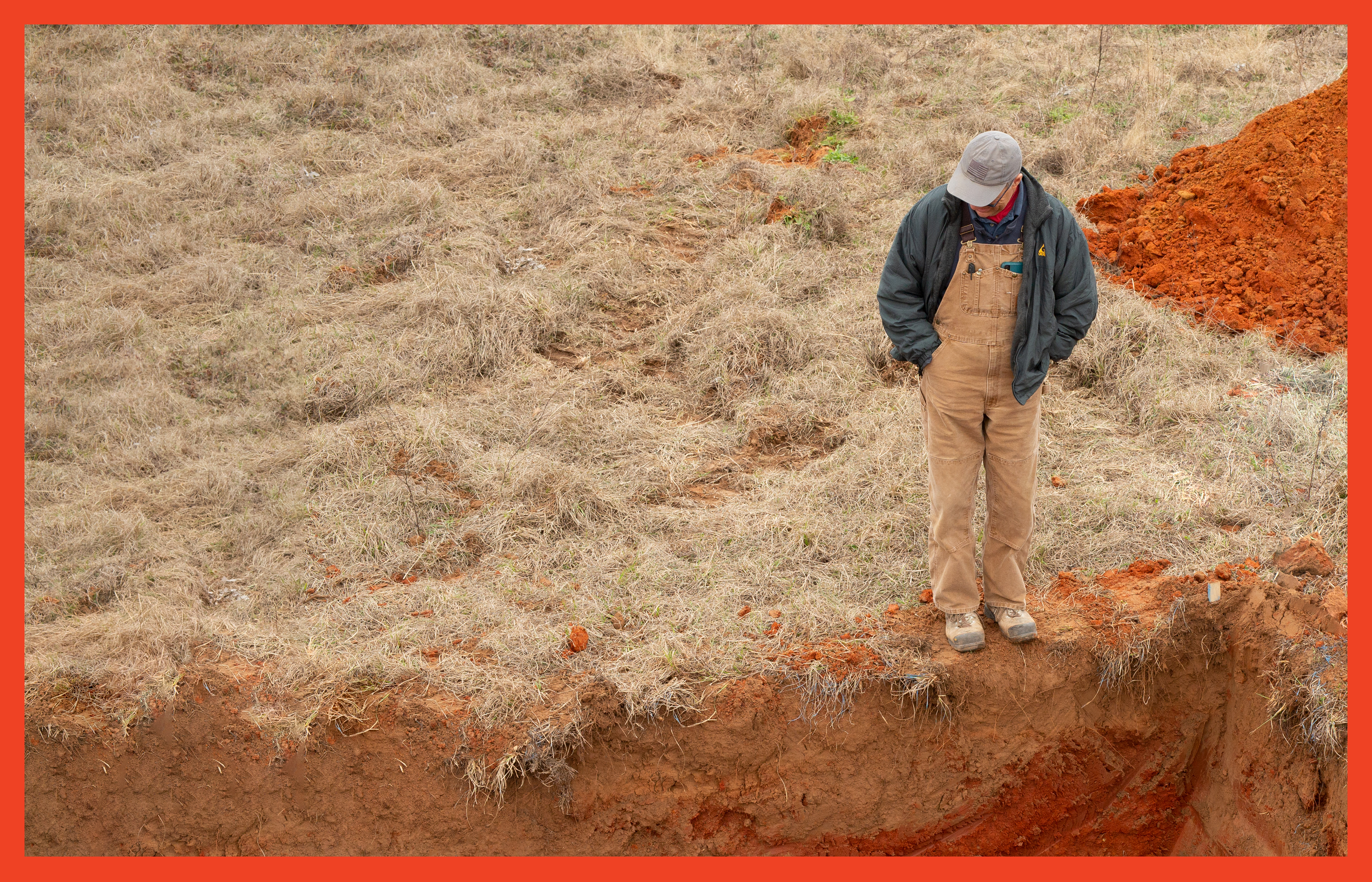
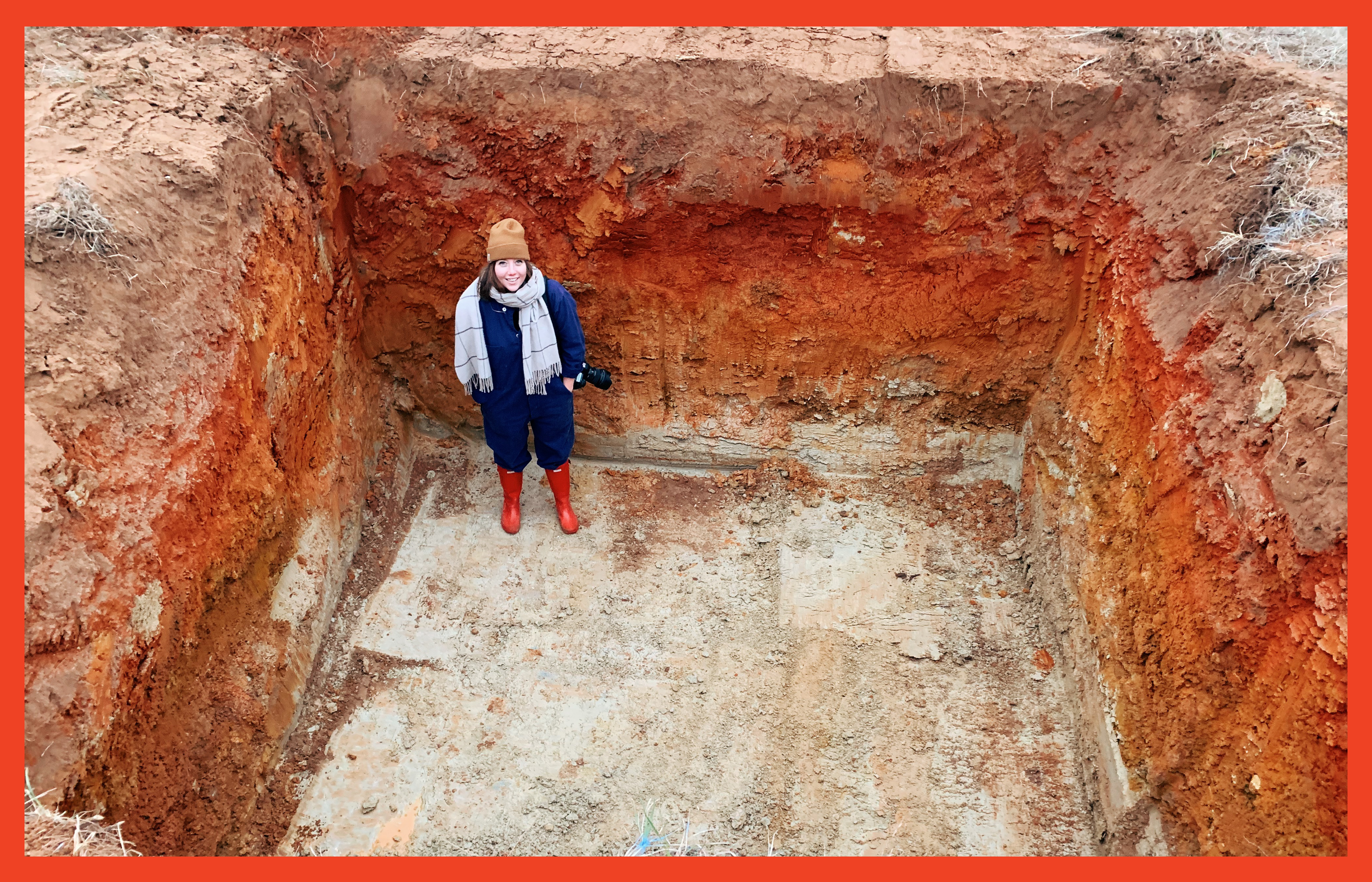
In February 2019, I had my father’s help again, this time with a 60G John Deere excavator. I planned to dig a hole twelve feet wide, twelve feet long, and eight feet deep in a field halfway between Houston and Austin. My father owns a dirt-work business, so backhoes and excavators are at my disposal. I decided to use this medium, not because of the conceptual similarities it shared with land art, although there are many, but because I was interested in designing without the bias of medium. I have no preconceptions on how to use an excavator, let alone design with one, and I love the contrast between the format of a book and that of land because it is so extreme. But I really only arrived at the idea of working with these tools and the earth because of the combination of accessibility and unfamiliarity.
When I arrived in Texas, I thought I would have a week to dig and perfect my dirt work. But my father had a busy work schedule and my week quickly diminished to a weekend. Weather interfered and my weekend was reduced to a single afternoon. The project that I had been conceptualizing for months was becoming something that would need to manifest as a quick, raw, and simple form exploration. Any elaborate digging plans I had were no longer possible, and I was forced to embrace creating form quickly within a medium and with a tool I had never used.
The morning of the dig, my father left very early to pick up the excavator from another job site while my mother, my dog, and I drove two hours west of Houston on I-10 to a friend’s ranch between Smithville and Bastrop. When we all arrived, my father and I explored the 115-acre property in our friends Kubota RTV 900, looking for the perfect spot to excavate. The land was flat, and as we were expecting rain, we decided to dig in an isolated field that was slightly elevated from the rest.
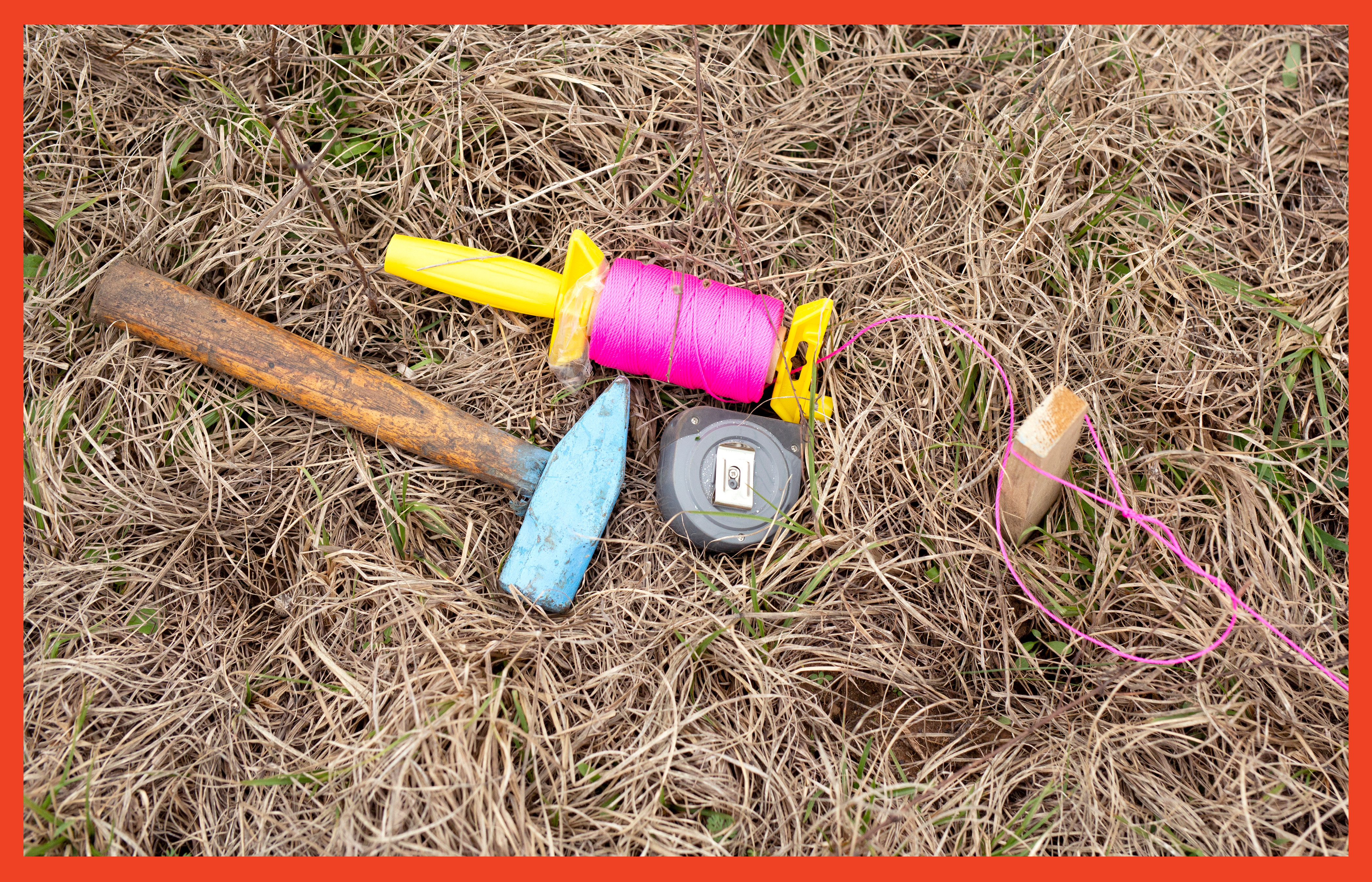
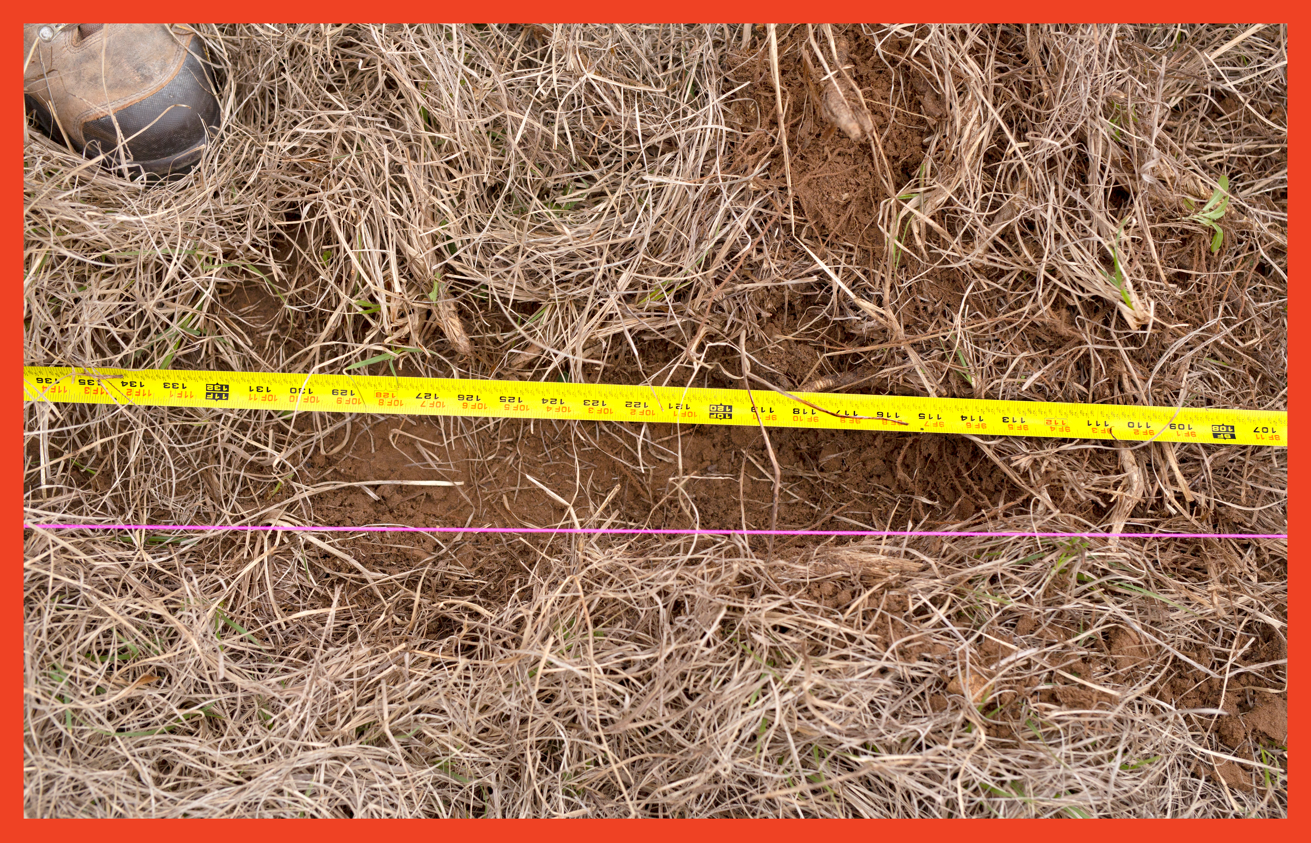
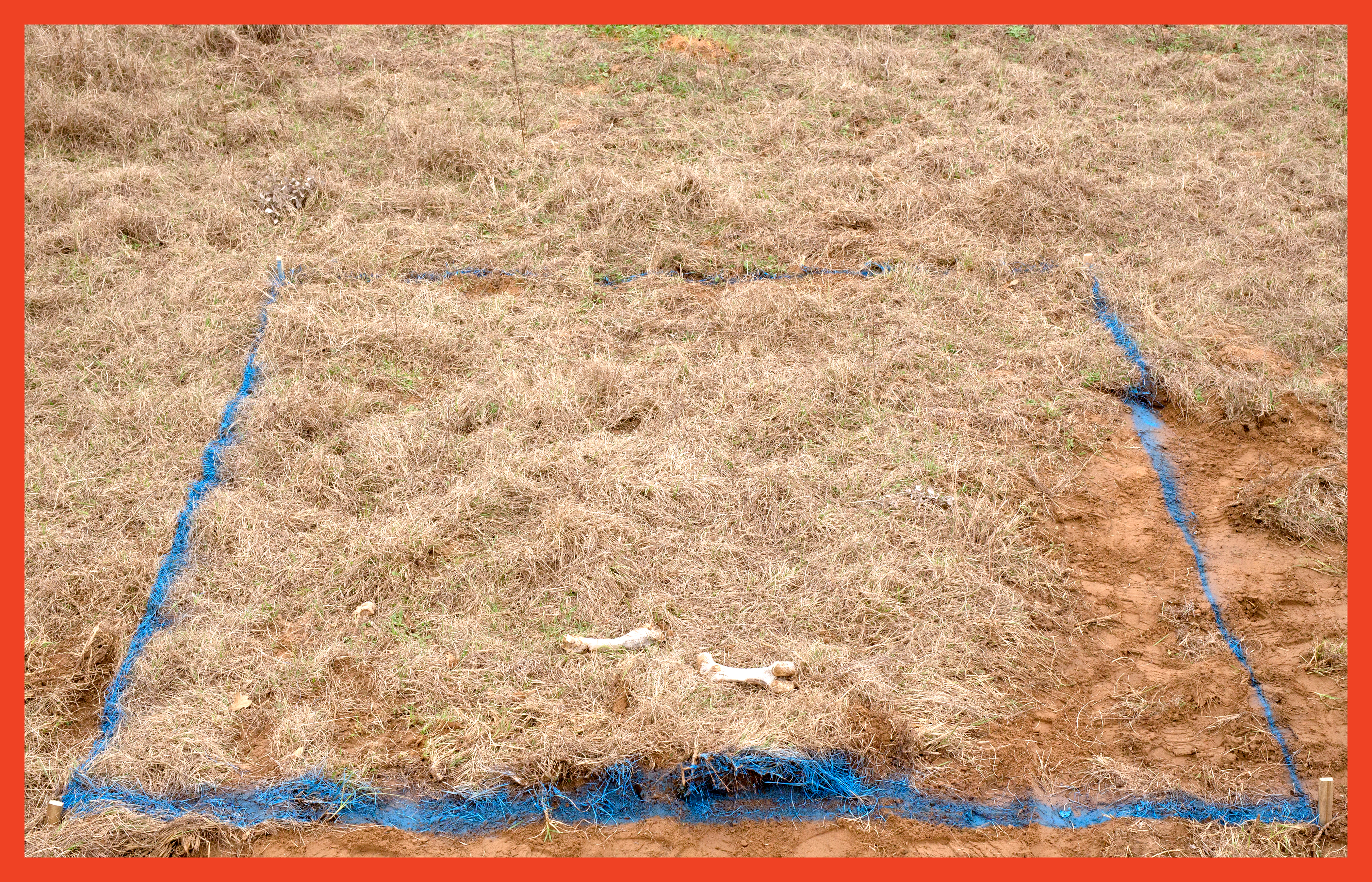
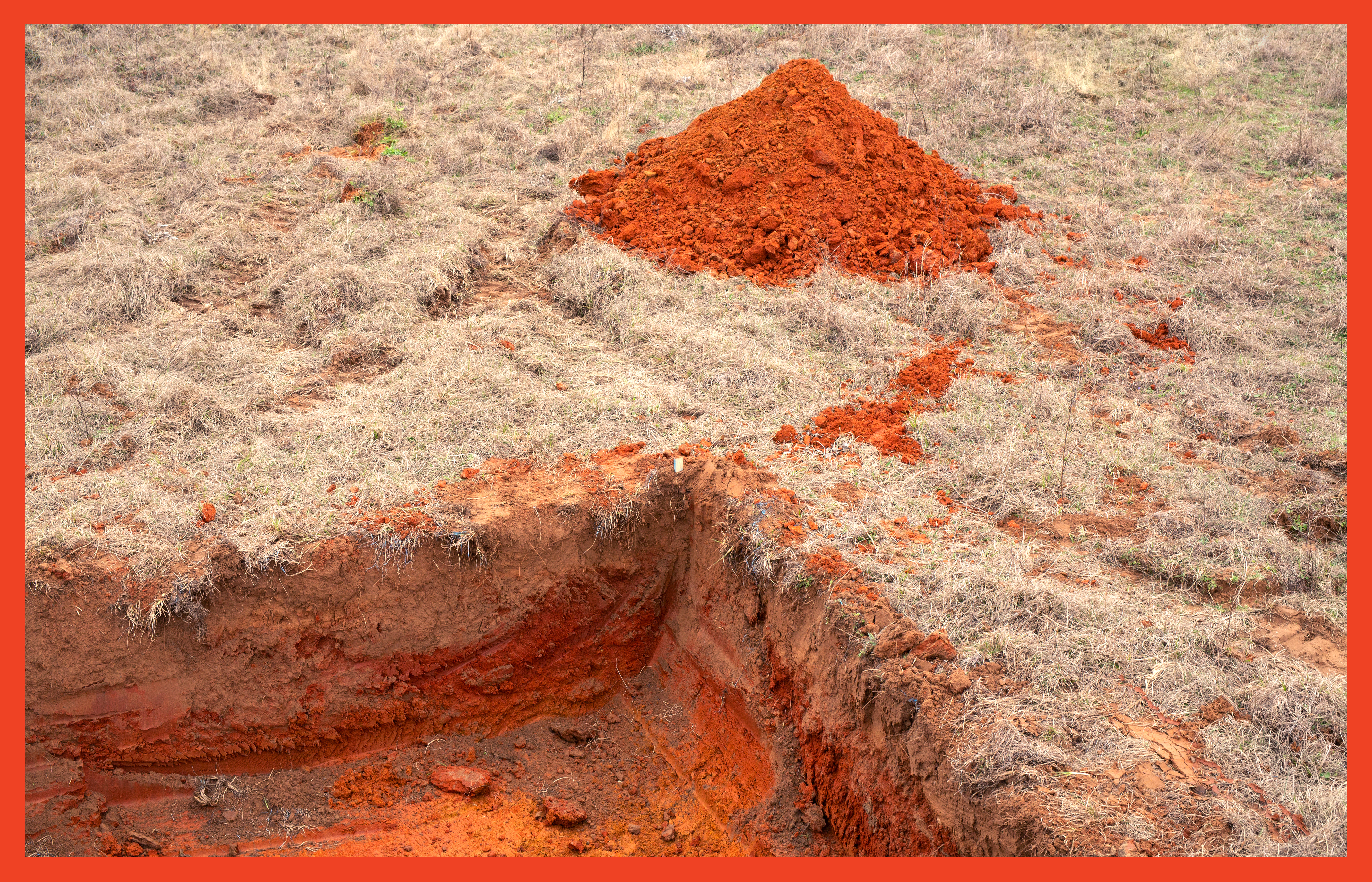
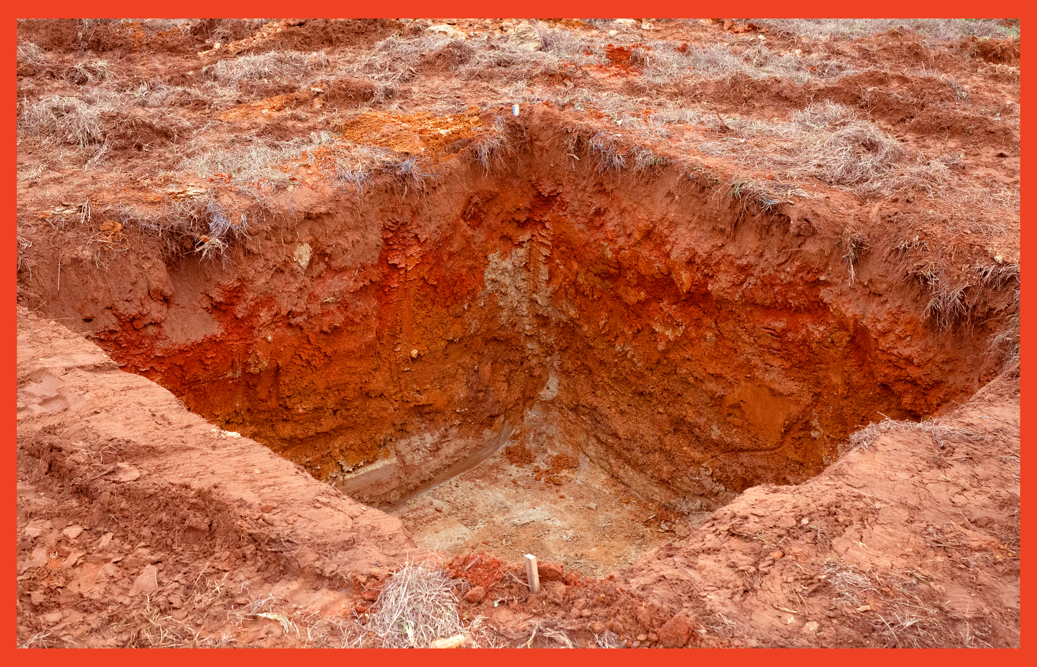
Together, my father and I measured out a twelve-by-twelve-foot square and hammered wooden stakes into the ground to define its corners. The stakes also served as supports for neon-pink string that connected the corners and defined the space. We spent thirty minutes making sure that our rectangle was square and adjusted the stakes ever so slightly until it was nearly perfect. We used a can of bright blue marking paint to trace this frame and when we removed the strings and posts, we had a blue outline to use as our guideline for digging.
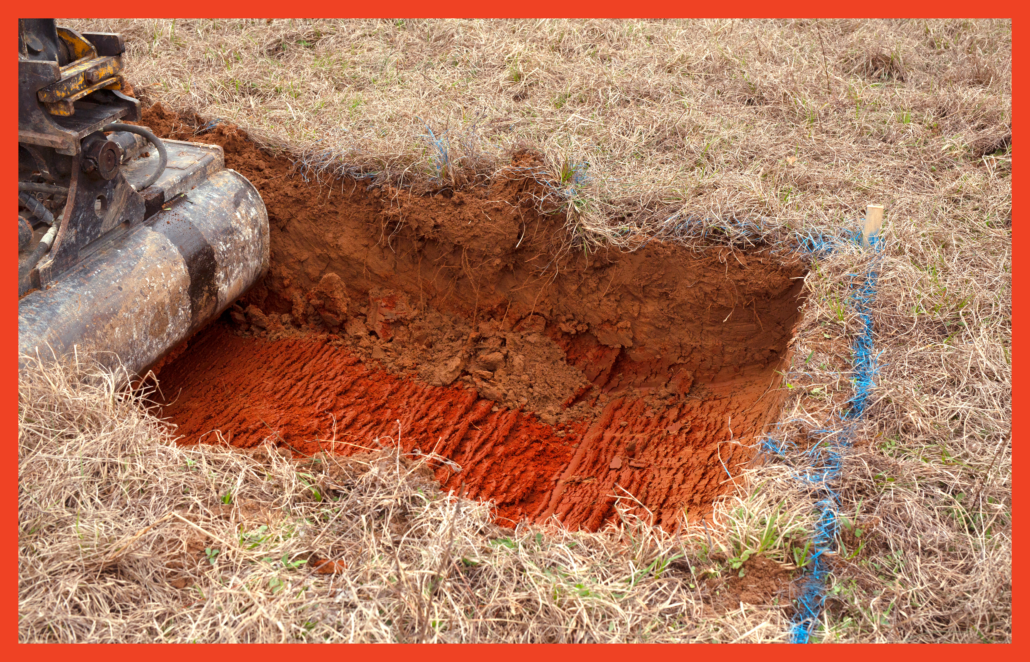
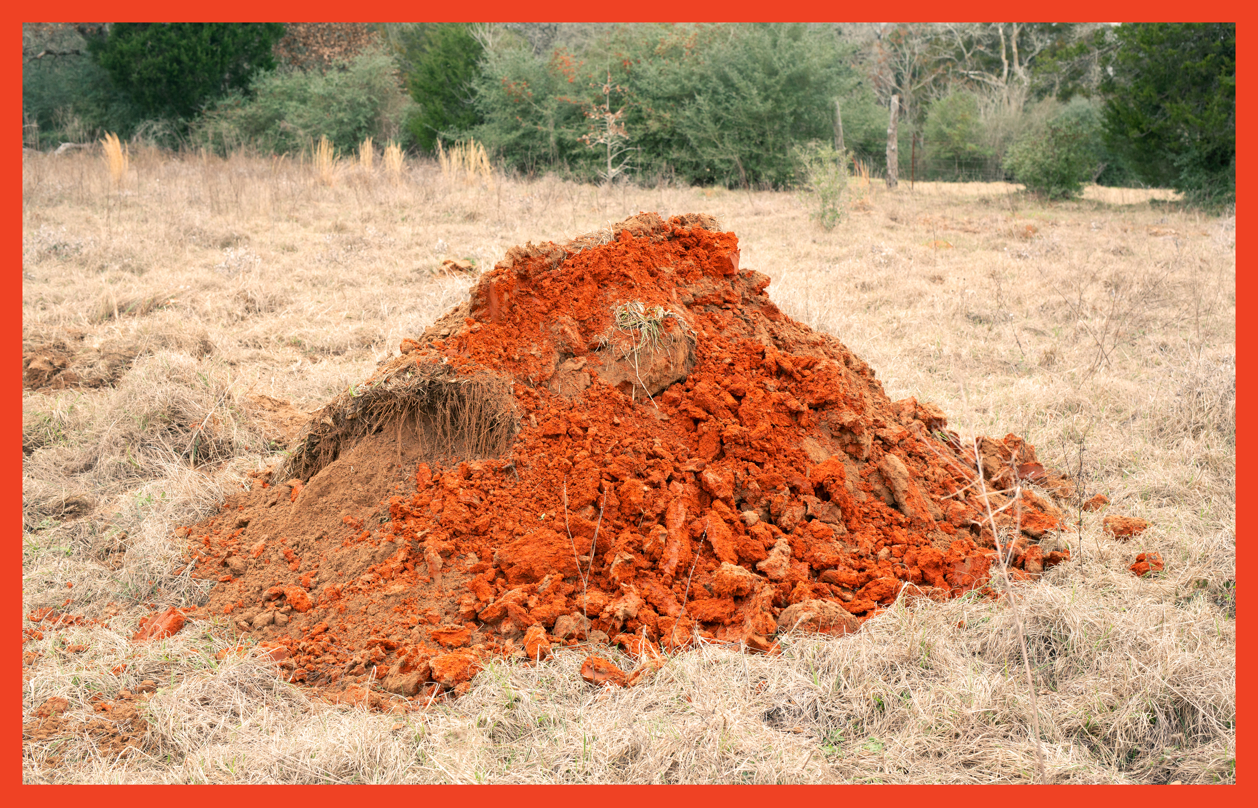
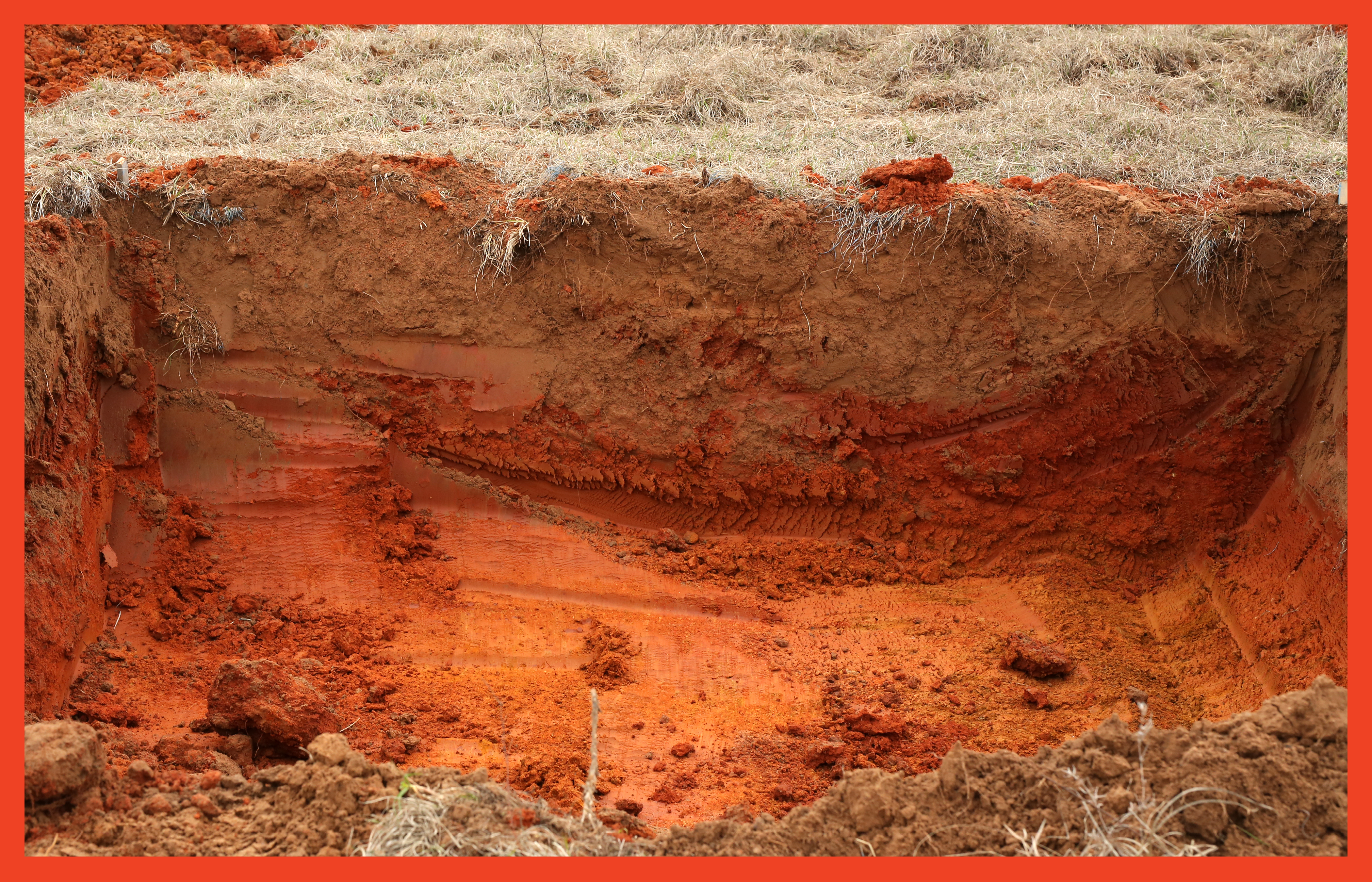
The digging began and my father made the first move. The bucket of his excavator gently scraped away the first layer of dirt and dried grass. As we descended through different levels earth, the dirt and clay revealed itself to be a brilliant red. As we dug deeper, the red faded to orange, the orange to yellow, the yellow back to brown, and finally at its base transitioned to a dirty white clay. Somewhere between the brown and white layers, we had hit the water table and the edges of our cube had started to soften and crumble as water very slowly seeped in from the sides and a small puddle started to form at its base. I had never even considered hitting the water table as a possibility. Having started digging in the early afternoon, the entire project raced against the loss of light and the certainty of rain. The process took us about three and a half hours and when the hole was finished, it was nearly completely dark.
We drove the excavator and the Kubota back to the ranch house where we showered, ate dinner with our friends, and spent the rest of the evening together in front of a fire drinking wine and whiskey. Throughout this process, my supportive but skeptical parents kept asking me, “But, how is this graphic design?” At this point, their skepticism was seeping in and through my exhaustion,
I was starting to have my own doubts.
Was this graphic design? Was it really?
![]()
In the 1960s conceptual artists challenged traditional methods of creating art, such as painting and printmaking, and started to explore a vast range of new materials. Ideas—instead of form or materiality—began to drive work, and artists posed questions instead of seeking answers. This new way of thinking created a shift in the art world and conceptual art started to redefine what it meant to be an artist. The shift opened up doors for new perspectives and ways of making and thinking. Conceptual artists began deconstructing their notions of what art was and pushed against these ideas to explore what art could be.
Art could now be anything.
In 1970 John Baldessari created The Cremation Project. He posted an announcement in a local San Diego newspaper:
Notice is hereby given that all works of art done by the undersigned between May 1953 and March 1966 in his possession as of July 24, 1970 were cremated on July 24,
1970 in San Diego, California.
This advertisement—along with the act of cremation and the photography that documented it—became the artwork. Baldessari pointedly kills his past as a painter and is reborn as a conceptual artist. From this point forward he begins experimenting with found photography and video. This forced process of unlearning and attempting to subvert his personal tastes and aesthetics gave him space to create a new visual language and form. The Cremation Project marked the beginning of a large body of Baldessari’s work that focused on the deconstruction and reassembly of fine art. His art began to focus on the testing of newly defined boundaries, or the lack thereof, in his practice.
Baldessari claimed Jean-Luc Godard as the single most important visual artist of the 1960s. Just as Baldessari questioned the structure of visual art, Godard rethought the structure of cinema. Not only did Godard challenge the rules of film technique by creating the jump cut, fragmenting points of view and distorting narrative order, he also became a true auteur and worked tirelessly to elevate cinema to the level of art.
Godard said, “Literature and painting both exist as art from the very start; the cinema does not.” Godard saw literature as the truest form of art, and he sprinkled his films with literary references. His characters are always extremely well-read and he even sometimes includes excerpts of literary works. He effortlessly intertwines literature and cinema history to create a dialogue between the two mediums and to stay critical of his context within both cinema and art. In Godard’s most recent film, The Image Book (2019), he sees his work not as a film, but as titled: a book and work of literature. In Sol LeWitt’s sixteenth sentence of Sentences on Conceptual Art, he writes “If words are used, and they proceed from ideas about art, then they are art and not literature.” This same logic same can apply to Godard’s relationship with film and art. By drawing these parallels, Godard claims space in literature with his cinema. His ideology transcends materiality and mirrors Baldessari’s emphasis on art being defined by ideas rather than by medium or form.
Directors, like graphic designers, often work in collaboration with others. Auteur theory created a metaphor between film and writing; the director became the author and his camera the pen. The metaphor elevates films by auteurs and constructs a sense of authorship and singular vision. Andre Bazin and François Truffaut were pioneers of the theory, and they used Bazin’s film magazine, Cahiers du cinéma, as a platform for publishing their ideas and critiques. Andrew Sarris, an American film critic who helped popularize auteur theory and even coined the term, proposed that to be an auteur, the director must have a signature visual style that is apparent across many works, proven technical expertise, and a clear vision that creates layered and complex meanings throughout their work.
The French New Wave opened up space for cinema in art while the conceptual artist redefined what art could be. Film and graphic design have parallels: both are not typically considered “art” and both are often collaborative. Instead of elevating design and claiming space and authorship, I am interested in opening up space and creating flexibility within the field. Graphic design is transitioning, and the role of a graphic designer has shifted dramatically since W. A. Dwiggins originated the term in 1922. We are no longer only making paste-up boards for advertising agencies; the graphic designer has become multidimensional and conceptual.
Historically, graphic design has been submissive because designers often work in close collaboration with clients, artists, and writers, and it is expected to elevate the work of others. In recent years graphic designers who express new levels of authorship and agency have emerged. There is a duality that exists within many design practices as designers work to balance a commercial practice that collaborates with clients with an independent practice that explores personal lines of inquiry. Graphic designers have created hundreds of new professional titles as they try to redefine themselves: experiential designer, performative designer, information designer, user interface designer, book designer, web designer, etc.—changing labels as they change projects and jobs. And sometimes graphic designers resort to calling themselves artists because it is easier than having the conversation or redefining what it means to be a graphic designer.
Graphic design can now be anything.
I believe that graphic design is not based on materiality (text and image, print and digital) but instead exists as a methodology and way of thinking about and filtering information and ideas. Graphic design is an art parallel to literature or fine art, but not a subset of the fine arts like painting. Like other arts, it has a range of quality and conceptual depth. The context in which we make work is crucial, and we do not create work in a vacuum. By calling ourselves graphic designers, we forge new spaces for our practice and start to shift public understanding of the term as it fluctuates. By deconstructing and rebuilding the definition to be more open, design can begin to open to new possibilities. The expanded definition will hopefully create new and more complex pedagogies and histories, embrace new critical perspectives, and allow graphic design to become fluid, accepting, and flexible.
If graphic design has the ability to be anything, what
happens when we step away from the forms we are comfortable with and explore design through new tools (perspectives) and instead of only focusing on the outcome, embrace process and unlearning? What happens when I create graphic design with my body or an excavator?
![]()
A few weeks after I dug my hole in Texas, I was still unclear if this space I had opened in the ground and conceptualized for months was indeed a work of graphic design. I looked up “graphic design” in the Merriam-Webster Dictionary. It says that graphic design is “the art or profession of using design elements to convey information or create an effect.” If you then further investigate the term “design elements” you will learn that this includes: point, line, shape, form, texture, color, value, and space.
My hole in the ground was, at its most fundamental level, all of these things. The points were the wooden stakes; the lines the pink string; the shape the blue square; the form the cube; the texture and color of the earth; the value the gradient transition between its layers; the space the hole itself.
So, I asked myself again. Is this graphic design? Is it really?
Yes. Yes, it is.
![]()
![]()
![]()
![]()
![]()
![]()
![]()
![]()
![]()
![]()
When I was in high school, I would go to the Menil Collection every day after school to smoke weed and lay in the sun. I remember going there all the time with my friends Josh and Camille and David. We would climb a big beautiful tree (which was cut down last year) and also on the Mark di Suvero sculpture Bygones. Sometimes—if we were feeling reflective—we would sit by Barnett Newman’s Broken Obelisk or quietly think in the Rothko Chapel. Every now and again we would walk over to the main lawn and lie in the grass parallel to Michael Heizer’s Isolated Mass / Circumflex #2 or sometimes sit cross-legged in its counter form. But we only did that on special occasions. With the exception of the Rothko Chapel, I never really thought about these sculptures as artworks, but instead considered the collection as the landscape of my childhood. Founded by Dominique de Menil, the French heiress to the Schlumberger fortune, the Menil Collection believes in accessibility and is always free. The museum’s holdings are diverse, including early to mid-twentieth century works and an extensive collection of pop art and contemporary art. The permanent collection also includes ancient, Byzantine, medieval, and tribal art. Philippa de Menil, the daughter of Dominique, was one of the founders of the Dia Foundation.
I first discovered Dia:Beacon a few years after I moved from Houston to New York City. My parents had bought a house in upstate New York, about an hour from the museum, and the Dia:Beacon became a semi-regular detour before heading back to the city on Metro North. Dia:Beacon focuses on art from the 1960s and after and primarily features works by minimalists, land artists, and conceptual artists. The museum creates amply scaled space for work that often attempts to transcend the traditional gallery context. While Dia:Beacon is an institution, its space is designed around artworks, instead of the other way around. Even though I had been exposed to these works throughout my life, at the Dia:Beacon and the Menil Collection, it was not until I went to graduate school that I would learn about the land artists, many of whom—like Walter de Maria, Michael Heizer, and Robert Smithson— are prominently featured at these museums.
Land artists were trying to transcend the limits of painting and sculpture and the restrictions of making art for the gallery space. They often did this by making monumental earthworks in the American Southwest. The documentary Troublemakers: The Story of Land Art discusses works such as Robert Smithson’s Spiral Jetty and Walter de Maria’s Lightning Fields, both of which are part of the Dia Foundation collection. The film talks about the land artists’ interests in unlearning and quotes Nancy Holt saying, “It was a matter of unlearning a lot of really sophisticated things that we had learned in our early adulthood.” The artist Walter de Maria talks about his transition from painting to land art, saying, “My new brush is a Caterpillar.”

When I was in the third grade, my parents placed me and six small cardboard boxes in the bucket of my father’s JCB front-end loader. My father extended the loader’s arm and lifted me eighteen feet in the air. I carefully pushed each box over the edge, too afraid to look down or to even peek my head over the bucket’s siding. Each box contained a single stemmed wine glass and a different packing material: foam, peanuts, bubble wrap, crumpled brown paper, and tissue paper; one box did not have any packing material. I was testing to see which material would offer the best protection for the wine glass and keep it from breaking. Most of the glasses broke, but my project received first place at my elementary school science fair.
In February 2019, I had my father’s help again, this time with a 60G John Deere excavator. I planned to dig a hole twelve feet wide, twelve feet long, and eight feet deep in a field halfway between Houston and Austin. My father owns a dirt-work business, so backhoes and excavators are at my disposal. I decided to use this medium, not because of the conceptual similarities it shared with land art, although there are many, but because I was interested in designing without the bias of medium. I have no preconceptions on how to use an excavator, let alone design with one, and I love the contrast between the format of a book and that of land because it is so extreme. But I really only arrived at the idea of working with these tools and the earth because of the combination of accessibility and unfamiliarity.
When I arrived in Texas, I thought I would have a week to dig and perfect my dirt work. But my father had a busy work schedule and my week quickly diminished to a weekend. Weather interfered and my weekend was reduced to a single afternoon. The project that I had been conceptualizing for months was becoming something that would need to manifest as a quick, raw, and simple form exploration. Any elaborate digging plans I had were no longer possible, and I was forced to embrace creating form quickly within a medium and with a tool I had never used.
The morning of the dig, my father left very early to pick up the excavator from another job site while my mother, my dog, and I drove two hours west of Houston on I-10 to a friend’s ranch between Smithville and Bastrop. When we all arrived, my father and I explored the 115-acre property in our friends Kubota RTV 900, looking for the perfect spot to excavate. The land was flat, and as we were expecting rain, we decided to dig in an isolated field that was slightly elevated from the rest.
Together, my father and I measured out a twelve-by-twelve-foot square and hammered wooden stakes into the ground to define its corners. The stakes also served as supports for neon-pink string that connected the corners and defined the space. We spent thirty minutes making sure that our rectangle was square and adjusted the stakes ever so slightly until it was nearly perfect. We used a can of bright blue marking paint to trace this frame and when we removed the strings and posts, we had a blue outline to use as our guideline for digging.
The digging began and my father made the first move. The bucket of his excavator gently scraped away the first layer of dirt and dried grass. As we descended through different levels earth, the dirt and clay revealed itself to be a brilliant red. As we dug deeper, the red faded to orange, the orange to yellow, the yellow back to brown, and finally at its base transitioned to a dirty white clay. Somewhere between the brown and white layers, we had hit the water table and the edges of our cube had started to soften and crumble as water very slowly seeped in from the sides and a small puddle started to form at its base. I had never even considered hitting the water table as a possibility. Having started digging in the early afternoon, the entire project raced against the loss of light and the certainty of rain. The process took us about three and a half hours and when the hole was finished, it was nearly completely dark.
We drove the excavator and the Kubota back to the ranch house where we showered, ate dinner with our friends, and spent the rest of the evening together in front of a fire drinking wine and whiskey. Throughout this process, my supportive but skeptical parents kept asking me, “But, how is this graphic design?” At this point, their skepticism was seeping in and through my exhaustion,
I was starting to have my own doubts.
Was this graphic design? Was it really?

In the 1960s conceptual artists challenged traditional methods of creating art, such as painting and printmaking, and started to explore a vast range of new materials. Ideas—instead of form or materiality—began to drive work, and artists posed questions instead of seeking answers. This new way of thinking created a shift in the art world and conceptual art started to redefine what it meant to be an artist. The shift opened up doors for new perspectives and ways of making and thinking. Conceptual artists began deconstructing their notions of what art was and pushed against these ideas to explore what art could be.
Art could now be anything.
In 1970 John Baldessari created The Cremation Project. He posted an announcement in a local San Diego newspaper:
Notice is hereby given that all works of art done by the undersigned between May 1953 and March 1966 in his possession as of July 24, 1970 were cremated on July 24,
1970 in San Diego, California.
This advertisement—along with the act of cremation and the photography that documented it—became the artwork. Baldessari pointedly kills his past as a painter and is reborn as a conceptual artist. From this point forward he begins experimenting with found photography and video. This forced process of unlearning and attempting to subvert his personal tastes and aesthetics gave him space to create a new visual language and form. The Cremation Project marked the beginning of a large body of Baldessari’s work that focused on the deconstruction and reassembly of fine art. His art began to focus on the testing of newly defined boundaries, or the lack thereof, in his practice.
Baldessari claimed Jean-Luc Godard as the single most important visual artist of the 1960s. Just as Baldessari questioned the structure of visual art, Godard rethought the structure of cinema. Not only did Godard challenge the rules of film technique by creating the jump cut, fragmenting points of view and distorting narrative order, he also became a true auteur and worked tirelessly to elevate cinema to the level of art.
Godard said, “Literature and painting both exist as art from the very start; the cinema does not.” Godard saw literature as the truest form of art, and he sprinkled his films with literary references. His characters are always extremely well-read and he even sometimes includes excerpts of literary works. He effortlessly intertwines literature and cinema history to create a dialogue between the two mediums and to stay critical of his context within both cinema and art. In Godard’s most recent film, The Image Book (2019), he sees his work not as a film, but as titled: a book and work of literature. In Sol LeWitt’s sixteenth sentence of Sentences on Conceptual Art, he writes “If words are used, and they proceed from ideas about art, then they are art and not literature.” This same logic same can apply to Godard’s relationship with film and art. By drawing these parallels, Godard claims space in literature with his cinema. His ideology transcends materiality and mirrors Baldessari’s emphasis on art being defined by ideas rather than by medium or form.
Directors, like graphic designers, often work in collaboration with others. Auteur theory created a metaphor between film and writing; the director became the author and his camera the pen. The metaphor elevates films by auteurs and constructs a sense of authorship and singular vision. Andre Bazin and François Truffaut were pioneers of the theory, and they used Bazin’s film magazine, Cahiers du cinéma, as a platform for publishing their ideas and critiques. Andrew Sarris, an American film critic who helped popularize auteur theory and even coined the term, proposed that to be an auteur, the director must have a signature visual style that is apparent across many works, proven technical expertise, and a clear vision that creates layered and complex meanings throughout their work.
The French New Wave opened up space for cinema in art while the conceptual artist redefined what art could be. Film and graphic design have parallels: both are not typically considered “art” and both are often collaborative. Instead of elevating design and claiming space and authorship, I am interested in opening up space and creating flexibility within the field. Graphic design is transitioning, and the role of a graphic designer has shifted dramatically since W. A. Dwiggins originated the term in 1922. We are no longer only making paste-up boards for advertising agencies; the graphic designer has become multidimensional and conceptual.
Historically, graphic design has been submissive because designers often work in close collaboration with clients, artists, and writers, and it is expected to elevate the work of others. In recent years graphic designers who express new levels of authorship and agency have emerged. There is a duality that exists within many design practices as designers work to balance a commercial practice that collaborates with clients with an independent practice that explores personal lines of inquiry. Graphic designers have created hundreds of new professional titles as they try to redefine themselves: experiential designer, performative designer, information designer, user interface designer, book designer, web designer, etc.—changing labels as they change projects and jobs. And sometimes graphic designers resort to calling themselves artists because it is easier than having the conversation or redefining what it means to be a graphic designer.
Graphic design can now be anything.
I believe that graphic design is not based on materiality (text and image, print and digital) but instead exists as a methodology and way of thinking about and filtering information and ideas. Graphic design is an art parallel to literature or fine art, but not a subset of the fine arts like painting. Like other arts, it has a range of quality and conceptual depth. The context in which we make work is crucial, and we do not create work in a vacuum. By calling ourselves graphic designers, we forge new spaces for our practice and start to shift public understanding of the term as it fluctuates. By deconstructing and rebuilding the definition to be more open, design can begin to open to new possibilities. The expanded definition will hopefully create new and more complex pedagogies and histories, embrace new critical perspectives, and allow graphic design to become fluid, accepting, and flexible.
If graphic design has the ability to be anything, what
happens when we step away from the forms we are comfortable with and explore design through new tools (perspectives) and instead of only focusing on the outcome, embrace process and unlearning? What happens when I create graphic design with my body or an excavator?

A few weeks after I dug my hole in Texas, I was still unclear if this space I had opened in the ground and conceptualized for months was indeed a work of graphic design. I looked up “graphic design” in the Merriam-Webster Dictionary. It says that graphic design is “the art or profession of using design elements to convey information or create an effect.” If you then further investigate the term “design elements” you will learn that this includes: point, line, shape, form, texture, color, value, and space.
My hole in the ground was, at its most fundamental level, all of these things. The points were the wooden stakes; the lines the pink string; the shape the blue square; the form the cube; the texture and color of the earth; the value the gradient transition between its layers; the space the hole itself.
So, I asked myself again. Is this graphic design? Is it really?
Yes. Yes, it is.